Presentation and Menus
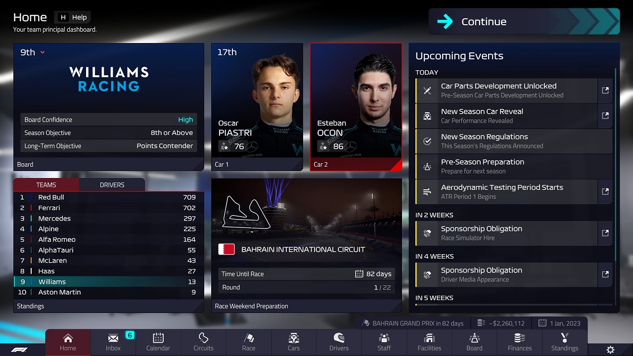
There is no doubt that the game looks good. The UI is easy to navigate, to be honest, it look quite inspired by Motorsport Manager, but that is not a bad thing. The main menu is a bit sparse, but nothing more is needed. It’s also logical, things are where you expect them to be, in the correct submenus. It’s good, useful, without being groundbreaking.
However, in those sub-menus things start to get a bit more complicated. As seen on multiple bug reports for the game. Engine manufacturers doesn’t really show up anywhere in the game, not on the constructor name or anywhere else. This might be due to licensing and manufacturers who doesn’t want their partners and customers to be shown with a different engine. As there are no engine manufacturer negotiation in the game, nor any “Suppliers” tab when you look at the car. It is understandable that many believes that engine manufacturers aren't included in the game.
They are, but they are hidden under "Cars -> Car # -> Powertrain -> Engine - View Manufacturers". It's somewhat the same when you build or upgrade facilities. It says on the upgraded facility that you will get another engineer slot, or more scouts to scout for talent. The thing is, that doesn't actually happen. You need to go to the staff menu, and in to engineering team to be able to hire more staff. Not a big problem in the grand scheme, but it isn't explained, and it isn't a logical way to do it. In fact, under the skin of it, the various submenus within the submenus gets less and less self explanatory.

A very clean and good UI - here represented with Williams 2023 (season standings is from 2022).
When you do start your first game, and start it with the usual welcoming helper, you are getting a fairly good overview of the game, but it never goes deep. You get the basics, and that's it.
The in-race presentation of the game is really good. David Croft sounds like himself, and not like he is going off a script when he introduce you to the first race at Bahrain, and the on screen HUD is inspired by the TV graphics in real life. The game also looks very good graphically. There's some complaints about blurriness and the graphics being cartoony at times. I think this is on purpose to make it look smoother. In some camera views, I'd argue it looks as good as racing games. They've really nailed that one.
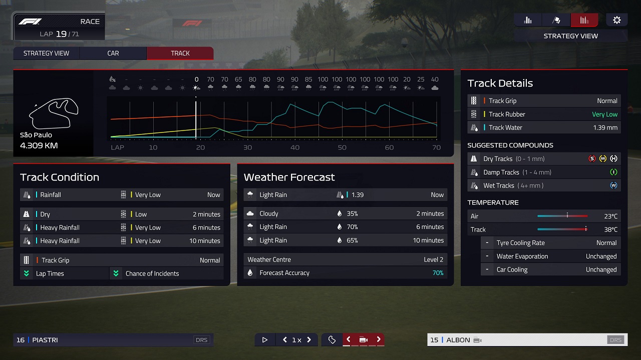
However, yet again the menus and what to click on isn't very intuitive, so it is a good thing you have a helper to guide you through the very basics yet again. However, I feel like it would've been better with a Motorsport Manager type of HUD when they aren't using the complete IRL package. There's just too much unnecessary stuff to click on to see what you want to see. The forecast is an example on this. Instead of just a simple button with forecast dropping down like in MM, you need to go in to the Strategy tab, then go to forecast. By doing that you can't do anything else. So if it has started raining when you look at it. You should pause the game, because by the time you have looked at the forecast it might be too late to pit, and you must go out of the different menus, and click on different menus to get to the pit now button. Oh, and it's not an simple "x" to go out, it's a back button. It is all clunky and involves a lot of clicking around.
You have commentating during the race, the race engineers and drivers actually talk with each other with proper soundbites, something which is really cool. However, after a few races you realize they say the same over and over again. It's a good idea, very fun and immersive at the start, but is pretty basic, and doesn't go very deep. This sadly is a recurring theme for the game.
 Track information during a race. Weather forecast is a bit off, we are already well into rain-time.
However, in those sub-menus things start to get a bit more complicated. As seen on multiple bug reports for the game. Engine manufacturers doesn’t really show up anywhere in the game, not on the constructor name or anywhere else. This might be due to licensing and manufacturers who doesn’t want their partners and customers to be shown with a different engine. As there are no engine manufacturer negotiation in the game, nor any “Suppliers” tab when you look at the car. It is understandable that many believes that engine manufacturers aren't included in the game.
They are, but they are hidden under "Cars -> Car # -> Powertrain -> Engine - View Manufacturers". It's somewhat the same when you build or upgrade facilities. It says on the upgraded facility that you will get another engineer slot, or more scouts to scout for talent. The thing is, that doesn't actually happen. You need to go to the staff menu, and in to engineering team to be able to hire more staff. Not a big problem in the grand scheme, but it isn't explained, and it isn't a logical way to do it. In fact, under the skin of it, the various submenus within the submenus gets less and less self explanatory.
A very clean and good UI - here represented with Williams 2023 (season standings is from 2022).
When you do start your first game, and start it with the usual welcoming helper, you are getting a fairly good overview of the game, but it never goes deep. You get the basics, and that's it.
The in-race presentation of the game is really good. David Croft sounds like himself, and not like he is going off a script when he introduce you to the first race at Bahrain, and the on screen HUD is inspired by the TV graphics in real life. The game also looks very good graphically. There's some complaints about blurriness and the graphics being cartoony at times. I think this is on purpose to make it look smoother. In some camera views, I'd argue it looks as good as racing games. They've really nailed that one.
However, yet again the menus and what to click on isn't very intuitive, so it is a good thing you have a helper to guide you through the very basics yet again. However, I feel like it would've been better with a Motorsport Manager type of HUD when they aren't using the complete IRL package. There's just too much unnecessary stuff to click on to see what you want to see. The forecast is an example on this. Instead of just a simple button with forecast dropping down like in MM, you need to go in to the Strategy tab, then go to forecast. By doing that you can't do anything else. So if it has started raining when you look at it. You should pause the game, because by the time you have looked at the forecast it might be too late to pit, and you must go out of the different menus, and click on different menus to get to the pit now button. Oh, and it's not an simple "x" to go out, it's a back button. It is all clunky and involves a lot of clicking around.
You have commentating during the race, the race engineers and drivers actually talk with each other with proper soundbites, something which is really cool. However, after a few races you realize they say the same over and over again. It's a good idea, very fun and immersive at the start, but is pretty basic, and doesn't go very deep. This sadly is a recurring theme for the game.
