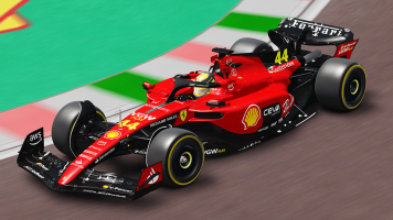
This includes test liveries and unraced liveries.
You are using an out of date browser. It may not display this or other websites correctly.
You should upgrade or use an alternative browser.
You should upgrade or use an alternative browser.
Worst F1 liveries
- Thread starter Har1MAS1415
- Start date
I agree with that.It takes a special kind of idiot to screw up a two tone paint scheme
View attachment 590625
D
Deleted member 1066209
-
Deleted member 1066209
I think it looks great...

Nope!
That definitely should have had more thought put into it.
Nope!
It was an F U! to the FIA who wouldn't let them run two different liveries in the one team, so they combined the two on the cars.
This is a Test Car, used to prevent spys from seeing airo so its not the race version.;It takes a special kind of idiot to screw up a two tone paint scheme
View attachment 590625
It was a smart idea they wanted Lucky Strike on one car and 777 (A aisian tobaco brand) on the other. FIA said they had to be the same. So they did a split with both concepts. Verry confusing for a fan as it was asymmetric.; But worth a try.That definitely should have had more thought put into it.
Function over form. It was made to make the aero secrets harder to decipher, not to look pretty - camouflage.I agree with that.
Agreed. If Reddit existed in 1999, this would've been a firm favourite in r/MaliciousCompliance.It was an F U! to the FIA who wouldn't let them run two different liveries in the one team, so they combined the two on the cars.
OP - "This includes test liveries and unraced liveries."This is a Test Car, used to prevent spys from seeing airo so its not the race version.;
so a valid submission
I'm glad someone gets the gist.OP - "This includes test liveries and unraced liveries."
so a valid submission
I get all of that but it's still ugly. Looks like Red Bull just let a flock of pigeons defecate all over it instead of actually painting it.Function over form. It was made to make the aero secrets harder to decipher, not to look pretty - camouflage.
Nope!
That's a weird way to write "yes!" My Datsun for rF2 club racing...
But on worst F1 liveries... I know it was for charity, but ugly. Yes.

I also dislike much of the liveries in different kind of racing today, as much seems to be "white with logos on". Then again, this was bad. There were less bad versions of that livery the same year.

There were reasons for it, but white with stuff on... With no sponsors they could've gone the historic Sauber-colors way, but no...

Dark green and Martini isn't pretty either!

Also, while I kinda liked the bit eccentric Benetton liveries... This was too much.

A bonus McLaren... It just didn't work with that color combo & design.


This car was formed by Honda and they pulled out. Ros Brawn and another person saved the team. It took Jenson Button to world championship. But ugly as it was plain and under sponsored. Making it look like it bellonged on the back of the grid. But deals where made at the last minuete. The only car i can think of with no logos on the sidepod.
The McLaren MP4-30 (all versions) had featureless sidepods. I personally felt it looked a bit dull once it changed from silver to black.This car was formed by Honda and they pulled out. Ros Brawn and another person saved the team. It took Jenson Button to world championship. But ugly as it was plain and under sponsored. Making it look like it bellonged on the back of the grid. But deals where made at the last minuete. The only car i can think of with no logos on the sidepod.
Last edited:
I actually like that. To my eyes all cars in all pro series today are so festooned with logos and decals and icons that they look too "busy"; who actually pays attention to all that anyway, especially when the car is moving. I wouldn't complain at all if they returned to just paint schemes and numbers; in F1 even to national colors, British green, Italian red, French blue, Spanish yellow, German silver, US white and blue, Japan white and red, etc..... The only car i can think of with no logos on the sidepod.
Latest News
-
F1 24’s Updated Driver Career Mode DetailedThe new aim of F1 24's driver career is to increase your recognition levels, and ultimately...
- Thomas Harrison-Lord
- Updated:
- 3 min read
-
Assetto Corsa Competizione’s Nordschleife Hits Consoles 2nd MayThe Nürburgring 24hr Pack DLC for Assetto Corsa Competizione arrives this time next week for...
- Thomas Harrison-Lord
- Updated:
- 2 min read
-
BeamNG Hotfix Adds Vehicle Detail Viewer And A Slew Of FixesBeamNG.drive's 0.32 update has been a huge hit with fans, the obligatory patch to partner the...
- Connor Minniss
- Updated:
- 3 min read
-
Gran Turismo 7’s Update 1.46 Includes Škoda’s Vision GTAn electric concept marks Škoda’s debut within Gran Turismo, and it will be joined by Honda’s...
- Thomas Harrison-Lord
- Updated:
- 4 min read
-
F1 Manager 2024’s New Mentality System, Pitbox Order DetailedAlongside being able to create a custom team, drivers can now be poached, races can be simulated...
- Thomas Harrison-Lord
- Updated:
- 2 min read
-
How The BTCC and Motorsport Games ReunitedIn a surprise move last week, official BTCC content will once again be present within rFactor 2...
- Thomas Harrison-Lord
- Updated:
- 5 min read
-
Sponsored MOZA Racing & Lamborghini Redefine Racing Boundaries with The Real Race Super Trofeo 2024MOZA Racing proudly announces its collaboration with Lamborghini for the launch of The Real Race...
- OverTake.gg
- Updated:
- 6 min read


