Number 1 :wink:

Please Help Me Pick a Logo
- Thread starter Linus Broström
- Start date


Latest News
-
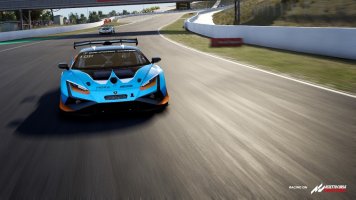
 PISTA Motorsport: New Dev Log Announces Early Access, Confirms ModsPISTA Motorsport developer REG Simulations is back with another dev log for their project...
- Yannik Haustein
- Updated:
- 3 min read
-
 World of Outlaws: Dirt Racing 24 is iRacing’s Dirt Oval SequelA sequel to the critically well-received World of Outlaws: Dirt Racing will slide into view this...
- Thomas Harrison-Lord
- Updated:
- 2 min read
-
Nordschleife Now On Console For Assetto Corsa CompetizioneAfter a relatively short wait, the Nürburgring Nordschleife can be driven on PS5 or Xbox Series...
- Thomas Harrison-Lord
- Updated:
- 1 min read
-
Fanatec Launches Second F1 Direct Drive BundleFollowing the recent extension of a licencing deal, here comes a CubSport DD and F1 wheel...
- Thomas Harrison-Lord
- Updated:
- 2 min read
-
Immersion Modding Group Releases 1993 F1 Pack For AMS2The 1990s throwback continues: Immersion Modding Group have released their 1993 Formula One...
- Yannik Haustein
- Updated:
- 3 min read
-
 MotoGP 24 ReviewThis year’s official MotoGP game is released today, 2nd May, and this time the blue-ribbon...
- Emily Jones
- Updated:
- 9 min read
-
30 Years Later: Remembering Ayrton SennaThe 1994 San Marino Grand Prix weekend went from lucky to shocking in the span of a day, and...
- Yannik Haustein
- Updated:
- 7 min read