Hi. This is probably something most people don't care about. On desktop the favicon is the red "R" from the RaceDepartment logo. It looks great. On android the favicon is "RD", which is distorted to fit into a square. I think it's quite ugly to be honest. So my request or question would be if it's possible to make it the same R as the desktop favicon or at least make the RD letters the same width but smaller height so it's less distorted.

Android Favicon
- Thread starter Peter Kerényi
- Start date
")


Latest News
-
 The Latest Ford Mustang GT3 Is Now In Assetto Corsa CompetizioneThe free update is live today, 7th May 2024, for PC players. A free update for Assetto Corsa...
- Thomas Harrison-Lord
- Updated:
- 2 min read
-
 A Sim Racer's First Time At Donington ParkDonington Park is one of the UK's most loved race circuits. As a sim racer, there is a very good...
- Connor Minniss
- Updated:
- 3 min read
-
![Luca [OT]](/data/avatars/s/3235/3235113.jpg?1697196734) Opinion: iRacing Cars And Tracks That Should Become Base ContentThe base content package on iRacing increased for 2024 Season 2 but Luca is wondering: Could...
Opinion: iRacing Cars And Tracks That Should Become Base ContentThe base content package on iRacing increased for 2024 Season 2 but Luca is wondering: Could...- Luca Munroe
- Updated:
- 7 min read
-
 GeneRally 2: Drift Car & Track Arrive In Cherry Blossom UpdateIndie top-down racer GeneRally 2 enters May with a small update - including a drift car and...
- Yannik Haustein
- Updated:
- 1 min read
-
 2023 Bike Racing Championships Officially in Sim RacingBikes may be a niche within the larger sim racing hobby, but there are plenty of games looking...
- Angus Martin
- Updated:
- 3 min read
-
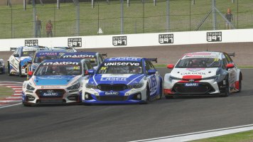
Racing Club Schedule: May 5 - 11Spring is here, but sunny, warm weather does not mean that you cannot scratch your racing itch -...
- Yannik Haustein
- Updated:
- 3 min read
-
2023 Racing Series Officially in Sim RacingThere are so many sim racing games out there aiming to recreate official real-world racing...
- Angus Martin
- Updated:
- 6 min read