Number 1 :wink:

Please Help Me Pick a Logo
- Thread starter Linus Broström
- Start date


Latest News
-
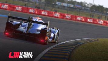
 Le Mans Ultimate’s 2024 WEC DLC, Subscriptions and ‘Complementary Services’ PreviewedA free update will add a unique co-op mode to Le Mans Ultimate in June, with possibly a free...
- Thomas Harrison-Lord
- Updated:
- 5 min read
-
F1 24 – Why Supercars Are Out and Anti-Cheat Is Still Work-in-ProgressSay goodbye to Ferrari Romas and Paul Ricard. Say hello to realigned priorities With the...
- Thomas Harrison-Lord
- Updated:
- 3 min read
-
Motorsport Games Revenues Jump 76% Following Le Mans Ultimate Early AccessThe company is still posting losses and is burning cash, but its recent release has stemmed the...
- Thomas Harrison-Lord
- Updated:
- 2 min read
-
F1 24 Will Receive Latest Formula 2 Car Post-LaunchAs expected, this F1 24 will arrive with last season’s Formula 2 action, before the new F2 car...
- Thomas Harrison-Lord
- Updated:
- 3 min read
-
Why Codemasters Hasn’t Changed Game Engine For F1 24F1 24 uses the Ego technology platform for a 16th consecutive instalment – the game’s lead, Lee...
- Thomas Harrison-Lord
- Updated:
- 4 min read
-
The Latest Ford Mustang GT3 Is Now In Assetto Corsa CompetizioneThe free update is live today, 7th May 2024, for PC players. A free update for Assetto Corsa...
- Thomas Harrison-Lord
- Updated:
- 2 min read
-
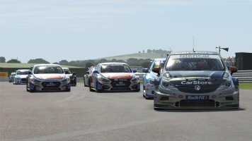
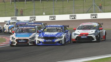
 A Sim Racer's First Time At Donington ParkDonington Park is one of the UK's most loved race circuits. As a sim racer, there is a very good...
- Connor Minniss
- Updated:
- 3 min read