Yes, the lower branches are modeled, but very low poly. Here is my new tree to the left and the more high poly simbin tree to the right. Hard to see any details when there are also trees behind.
Also made a mesh for more visible bush-like trees and a new fence texture, and trying to make the tree textures a little bit better. Still very much WIP
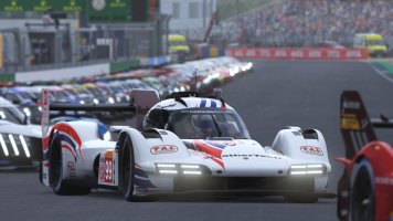
This is the main car texture (smart) upscaled to 200% x 200% in a test. Not sure if it is worth the extra memory usage? Also not sure what effect it might have on performance, but I guess that we will find out.
Porto has got one more materials overhaul. There is a HUGE number of materials in this track.
I like these Porto trees, not bad
I never liked driving at street tracks much, but there are a lot of nice details added to them.
I use upscaler (Gimp) on cockpit textures sometimes. But if the textures are not great to begin then upscale will just make them larger not great textures
Would be a little worried about the trees will introduce z-flicker?
There are one tree like that on Estoril you cam only see it after you turn the corner at very short distance so no Z-Flicker.
Love this! Looks great. Any chance of a dark mode option? For instance simply by keeping the red text and swapping dark for white backgrounds for the UI elements?
Yes that was a strange coincidence
We can still use your style. I made some tests trying to replicate the logos, but sadly the low resolution made it look bad, so that is a challenge. Also the lack of usable fonts. I would prefer if we could use your font choice, but some things would still have to be BankGothic and would look out of place
Why? You mean because the font is hardcoded? Or because of it being TGA? If so, let's go for replacing that font Maybe a hard nut to crack, but at least I would like to give it a try!
The font tga files are in a strange format with included mapping, I have tried 4-5 different softwares to replace it when working on the other UI but no luck then
It always resulted in game crash or the font just not being loaded. But if it is possible somehow it would be good of course.
Maybe there is no need for much rearranging, I think we can achieve much by replacing background, move some things a little bit and make new icons if we are ok with that.
The font tga files are in a strange format with included mapping, I have tried 4-5 different softwares to replace it when working on the other UI but no luck then
It always resulted in game crash or the font just not being loaded. But if it is possible somehow it would be good of course.
To be honest, I would be very surprised if the TGA isn't just a graphic. In the past I've seen many games and also other software that used this type of font implementation because the may had no good technique to include "real" fonts. Inside the software they are working with coordinates, but that requires the graphic of your font to have letters placed in a specific location. If that makes sense.
Anyhow, to confirm my assumption, I did a quick test: I opened the "BankGothic_Md_BT_45px.tga" (used for the "MAIN MENU" title) with GIMP, erased the "down-bow" of the "M", and saved the TGA back with "RLE compression" disabled and origin set to "Bottom left".
And this was the result:
Not sure why you had issues here!?
So going forward, there is software like the "Bitmap Font Generator" or also simple scripts on Github (e.g., this or this) that can be used to create the needed type of font bitmaps. And of course with some more manual work the results could be achieved using Inkscape (basically typing all required letters as individual text objects and then arranging them on a grid). The font I have used in my recent assets was "EXO New" which is free and available through Google fonts, which allows it to be used with some scripts right away.
Anyhow, I won't be able to invest more time on this now. So if you'd like, feel free to have a look and see if you can replicate the above. Would be great to have the confirmation the above wasn't just a coincident on my end
Great, I tried the same, but it didn't work for me, it crashed the game, somehow it saved in wrong format. Also tried bitmap font generator.
But I will test it again now when I know it works for you
Update: It works to erase pixels the same way as you did at least
Now I will test to add new font
As soon as I add new things (new letters) to the tga file the game crashes
Maybe some other method can be used, like pasting pixels from one file to another on the single layer...
It works, so I have to create a separate file and then paste the pixels over the first file. For some reason the format is kept that way, but not if I add a layer, not even if they are merged to one.
Strange, even replacing letters works for me
And that's how it looks in GIMP:
I did write "MAIN MENU" with the font tool, discarded the text info, copied & pasted the letters over the original ones, erased the original letters, then merged all new letters down to the background layer, and saved the single layered bitmap as TGA as I described before. I used the DEV branch (2.99.9) of GIMP, but I believe that does not really make the difference here. Can test with current stable GIMP of course, if you still don't get the same results.
Hard to place some letters right, seems like the game has some smart way to find out how much space every letter needs, but it doesn't work perfectly. Needs some more tweaking, and the result will not be 100% perfect in the end I think.
Should we keep Eurosport stars to the left in menu?
")