Skins Help with logo placement on wheel arches

I'm currently painting the #29 Audi from Daytona and making good progress. However there are continental logos on all 4 wheel arches and I'm struggling to get it to look good. Any advice for placing, warping etc?

I've tried it in both 2d and 3d (both orthographic and perspective views) in Photoshop.
Here's a photo of the real car to show what I'm talking about...
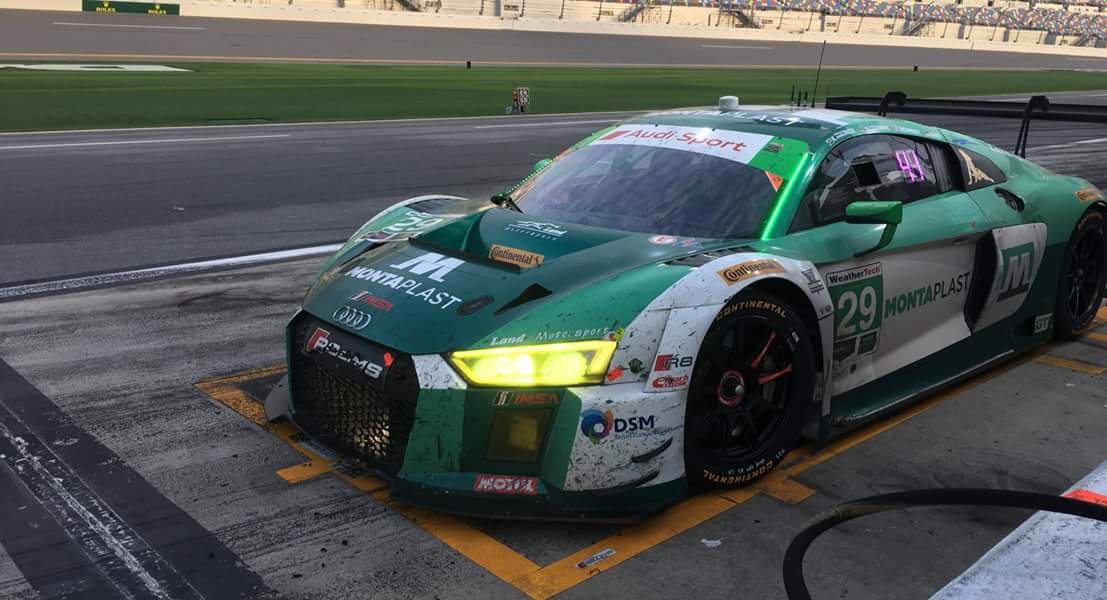
.facebook_1517438271202.jpg
 
If you have the unpacked/ripped 3D model working with 3D paint, than you shouldn't have any problem at all.
Unless the logo is not set up properly before merging, like orientation of the plane with the logo, etc...
 
If you have the unpacked/ripped 3D model working with 3D paint, than you shouldn't have any problem at all.
Unless the logo is not set up properly before merging, like orientation of the plane with the logo, etc...
I'm finding 3D photoshop quite fiddly to get lined up to place things. However I did have another go earlier today and managed to get it looking pretty good...
39992294222_c44dfe66dd_o.jpg

Once I did one side, I then went to 2D and mirrored it for the other side of the car and used those layers to line up the ones for the other side back in 3D the correct way around.

There's a few wobbly lines here and there, but I am expecting to be able to clean those up with layer masks and a paint brush. This one's almost done now just a few more sponsors and the driver names to add. I thought this one was quite simple but as I was working on it and looking at photos, there's a lot more sponsors than I initially thought! :laugh:
 
Paint brush, really? ;)
You still use rastered logos & lines instead of vectorizied ones in 2018? :p
Yeah it was a vector logo used - actually from the continental website. Seems to loose some sharpness as well when it is curved to fit the arch. Try to use vectors wherever possible but sometime all you can find is a png! Also am new at this skinning thing so still learning every day :p
 
I nearly rebuild all the logos i used by now, as many you could get have flaws. And simple ones without gradients etc. are quick to rebuild and if you find a matching font makes it faster.
With the use of smart-objects you could easyly curve and defrom vector objects and don't loose quality compared to raster objects.
 

Latest News

Are you buying car setups?

  • Yes

  • No


Results are only viewable after voting.
Back
Top