

Resource icon
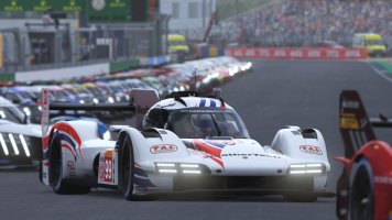
M3 GT2 team Spirit 1.0
- Author maranello78
- Creation date
Latest reviews


Latest News
-
 F1 Manager 2024’s New Mentality System, Pitbox Order DetailedAlongside being able to create a custom team, drivers can now be poached, races can be simulated...
- Thomas Harrison-Lord
- Updated:
- 2 min read
-
Gran Turismo 7’s Next Update Includes Škoda’s Vision GTAn electric concept marks Škoda’s debut within Gran Turismo, and it will be joined by Honda’s...
- Thomas Harrison-Lord
- Updated:
- 2 min read
-
How The BTCC and Motorsport Games ReunitedIn a surprise move last week, official BTCC content will once again be present within rFactor 2...
- Thomas Harrison-Lord
- Updated:
- 5 min read
-
 Sponsored MOZA Racing & Lamborghini Redefine Racing Boundaries with The Real Race Super Trofeo 2024MOZA Racing proudly announces its collaboration with Lamborghini for the launch of The Real Race...
- OverTake.gg
- Updated:
- 6 min read
-
Forza Horizon 5 Apex Allstars Update Adds Five New Race Cars, Plus Yet More DLCA new Apex Allstars Festival Playlist kicks off this Thursday in Forza Horizon 5, joined by a...
- Thomas Harrison-Lord
- Updated:
- 3 min read
-
F1 24's Updated Car Performance and Handling ExplainedWhile we haven’t tested it yet, on paper it sounds like significant changes have been made to...
- Thomas Harrison-Lord
- Updated:
- 3 min read
-
Tim Jarschel Wins 2024 DTM Esports Pro championshipCombining searing pace with consistency, Jarschel took home the title despite a charge from...
- Thomas Harrison-Lord
- Updated:
- 3 min read
More mods from maranello78
-
 Audi R8 GT2 Race-Online Motorsportsfantasy livery
 -
 Porsche 911 GT2 RS911 Martini livery, where u can choose background color
 -
Lexus Raw Energy DrinkSpanish Raw energy drink sponsor of our ACC league
-
992 Cup NFS992 Cup for ACC inspired by NFS liveries
-
 Mclaren 720 Redbull customizablelivery from our Spanish League, with customizable colours
You can count on me for future projects, thank you very much