Anyone else feel like theres way too much wasted space in the UI. For instance, i have a 2k monitor, and i can only see 6 tracks at a time. We should be able to see at least 10 - 12 tracks at a time. Something as minor as that would make such a big difference in the experience. Everything is just so cluttered up in the center of the screen. I hope the pc version of this game gets the console UI as an option at least. Or some sort of overhaul. Anyway just an observation.. back to racing

Ui refinement (non racing issue)
- Thread starter Greg Latty
- Start date


Latest News
-
![Luca [OT]](/data/avatars/s/3235/3235113.jpg?1697196734) Guide: How To Negotiate Traffic in Endurance RacesWith the Nürburgring 24 Hours iRacing Special Event taking place this weekend, traffic...
Guide: How To Negotiate Traffic in Endurance RacesWith the Nürburgring 24 Hours iRacing Special Event taking place this weekend, traffic...- Luca Munro
- Updated:
- 5 min read
-
 Hot Lap Racing Shows Switch GameplayThe first gameplay showcase of Hot Lap Racing is here, showing various captures from the...
- Yannik Haustein
- Updated:
- 2 min read
-
Rennsport Beta Update 1.8.5 Adds Surprise LMDh Car, Rolling StartsThe latest beta release is here: Rennsport update 1.8.5 adds two current endurance prototype...
- Yannik Haustein
- Updated:
- 2 min read
-
 2024 Formula One Emilia Romagna Grand PrixAfter a somewhat surprisingly intense Miami Grand Prix, Formula One returns to Imola for the...
- Connor Minniss
- Updated:
- 3 min read
-
Vehicle Software Company Marble Labs Announces Potential FFB Replacement TechForce Feedback is essential to enjoying sim racing. US-based vehicle software company Marble...
- Yannik Haustein
- Updated:
- 3 min read
-
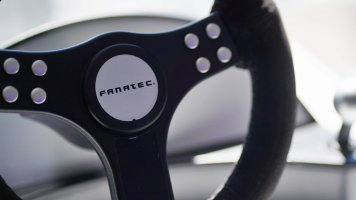
 Corsair In Pole Position To Purchase Fanatec, Provide Interim Funding (Updated)The plot thickens, as Corsair signs an agreement to “negotiate exclusively” with the beleaguered...
- Thomas Harrison-Lord
- Updated:
- 4 min read
-
F1 Manager 2024 Create A Team & Mechanical Failures: Our First ImpressionsThis summer, F1 Manager 2024 sets out to expand upon the previous two games that allowed F1 fans...
- Yannik Haustein
- Updated:
- 6 min read